Although this page is being prepared almost a year in advance of the 2019 eclipse, there is already quite a bit of activity and discussion related to travel planning and preparation of contingency plans in case of cloudiness. Here I discuss some basic sources of the most valuable imagery, and also some simple sources of forecast data of cloud cover. Some of this is similar to that prepared for the 2017 USA eclipse but some things have changed.
Perhaps the most convenient source of frequent visible satellite imagery from the newest Geostationary satellite (GOES-16) operated by the US is here:
https://weather.msfc.nasa.gov/goes/abi/goesEastfullDiskband02.html
There are many other sources of this imagery, but the NASA Marshall Spaceflight Center link above I have found to be the most convenient to use.
When you click on this link you will see a page like:
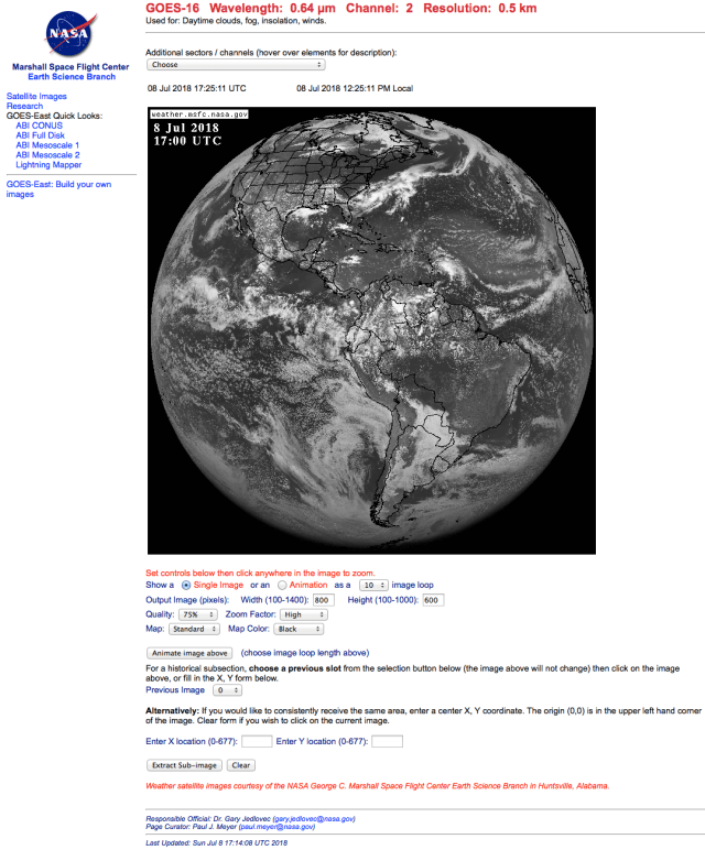
Default GOES-16 image from the NASA Marshall Spaceflight Center page (date will be current date)
You can select from many channels (frequencies) and two domains (CONUS and Full Disk). The red visible wavelength channel is .64 microns (channel 2), a commonly see infrared channel is 14 (11.2 microns). Note that for infrared channels there are many “enhancement curves” to display different ranges of brightness temperature, the one most commonly used is the “IR1”.

The sector and satellite radiance band are selectable, for eclipse 2019 the Full Disk/ .64 micron band is most useful for short-term extrapolation of cloudiness. Full disk imagery is updated every 15 minutes.
You can select from the top box either a CONUS or Full Disk sector…the CONUS only covers the area shown below:

Example of the area covered by the CONUS sector. This has new images every 5 minutes.
There are some setting you can play with, including the Zoom factor (High, Medium or Low) and the output quality of the jpg file (from 55% to 100%). The controls look like those shown below (I’ve cropped my screen captures to just show the relevant part):

selecting the zoom factor…

selecting the quality factor (more or less jpg compression)
Also, you can select the width and height of the jpg output – I use the larger file size 1400 by 1000 pixels, but the default is 800 x 600. You can also eliminate the map (coastline and political borders) and of course you can animate a sequence of images (up to 50).

An 800 by 600 pixel image of the primary eclipse area… note that you can set the x, y position of the image to make sure you reproduce exactly the area you want – day after day. You can build cloud climatologies for a specific area this way.
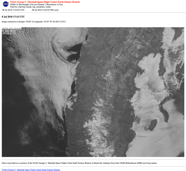
A 1400 by 1000 pixel area using almost the same x, y position (365, 531) as the previous image. The pixel resolution is the same, only the actual image area is larger.
The advantage of using the CONUS sector is that images are updated every 5 minutes, whereas the Full Disk imagery is updated every 15 minutes. Both have 500m pixel resolution (at the satellite sub-point on the Equator at least). This is twice that of the previous GOES satellites and the new imagery has twice the frequency for the Full Disk sector. There are also more satellite channels to look at, though for most eclipse purposes the visible channel is best, but if you wish to see the infrared channels you can look at channel 13 or 14, which will provide nighttime estimates of cloudiness (but clouds can be confused with the surface temperature at this frequency). Because the July 2019 eclipse will be late in the day the visible imagery should be sufficient for any final observing position adjustments that might be needed.
An example of the kind of movie loop you can generate is shown here:
Slightly higher spatial resolution (250 m pixels) can be found at: https://worldview.earthdata.nasa.gov but this imagery is delayed a few hours, with three sun-sychronous polar orbiting satellites contributing similar imagery at different times (Aqua, Terra and Suomi).

The imagery are obtained near 1030 and 1330 local time (anywhere over the earth – not a snapshot of the entire world but rather a 24-h mosaic constantly updated, swath by swath… The plus side of the Worldview website is that you can select a sector and download it in kmz format so you can see the underlying geography in Google Earth. See the sector I cut (below) for April 18 2018 showing the coastal stratus (it was a better example of the stratus and its relation to coastal topography than the July 2 example). A few variations of it, merged with shaded relief topography are shown below, but you can download the kmz files for topography here and the April 18 sector I cut here and play as you wish.
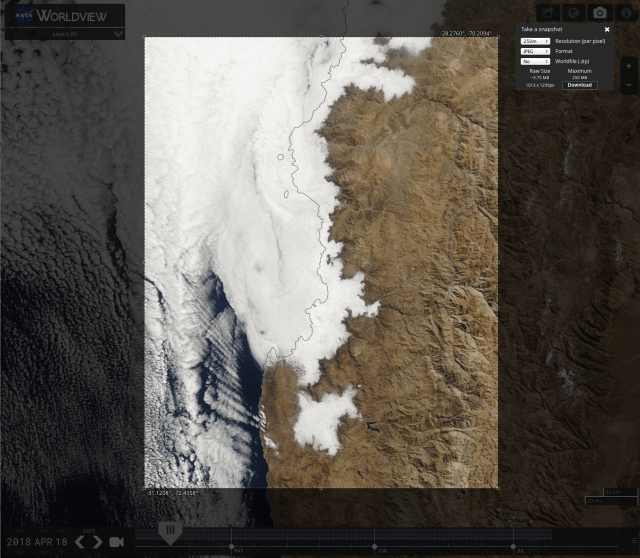
This is what I cut from a specific part of the Worldview mosaic for the Terra satellite on April 18 2018. In the window labeled “format” you can select various formats for the download, including kmz (for Google Earth visualization).
Using Google Earth to overlay the April 18 image with a digital shaded relief layer we obtain the images below:


Forecast cloudiness from numerical model output
A convenient visualization of two global model forecasts can be found here:
https://www.windy.com/?clouds,-32.138,-70.587,6
This link covers the Chile-Argentina eclipse area, but you can zoom in or out or look at any part of the globe since the forecasts are made by global models. You can also select different levels of the atmosphere and many different quantities. The two models, the ECMWF and the GFS, have different resolutions and different characteristics, and one is not uniformly better than the other, though the European one (ECMWF) is generally considered more accurate. Forecasters look at output from many different models and from ensembles of the same model (using slightly different initial conditions) to get estimates of uncertainties in the forecasts.
