The 2019 Chilean eclipse page has move here.
Old material related to the the USA 2017 eclipse…
Here we describe the mean daytime cloudiness as estimated from about 10 years of twice-daily MODIS visible imagery (15 years exist but we didn’t have easy access to all of it). The procedures used to do this are described in Douglas et al 2016 or in this powerpoint presentation. Basically there are two NASA research satellites (called Terra and Aqua from Latin for “Earth” and “Water”) that carry the MODIS sensor package and they are in sun-synchronous orbits. This means they provide imagery at about the same time each day (Terra at 1030AM and Aqua at 130PM for the daytime overpasses). An example of the averaged cloudiness for the southern Appalachians is shown below:

- Terra estimated mean cloudiness (@1030AM) for July-Sept period for southern Appalachians
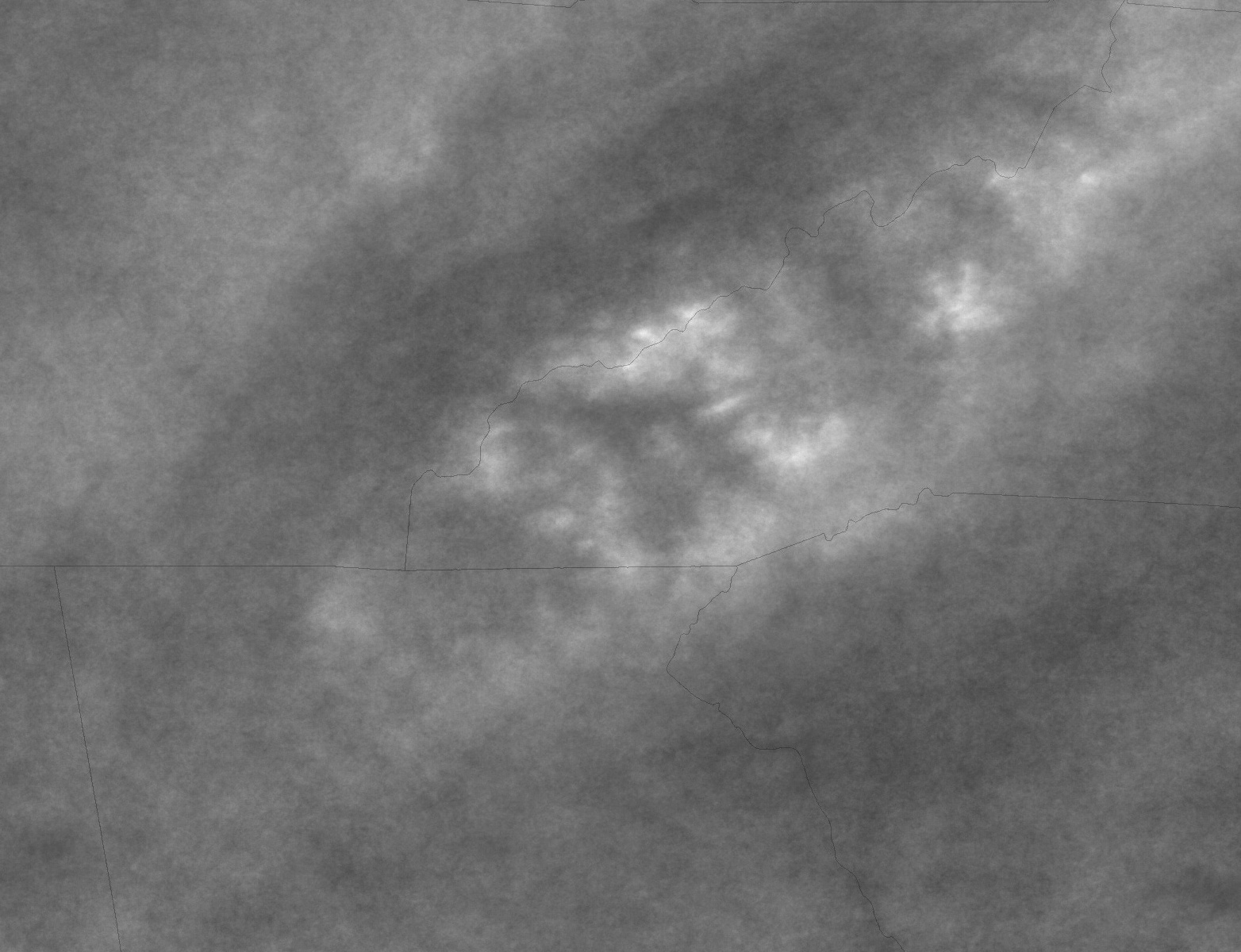
- Aqua estimated mean cloudiness (@130PM) for July-Sept period for southern Appalachians
Note that there is more cloudiness in the early afternoon than the late morning, but otherwise the patterns are quite similar. For this reason we have averaged the Terra and Aqua imagery to get slightly smoother patterns. To produce these averages we used the visible imagery from these two satellites to extract the cloudy pixels from each daily image for a number of years. These are averaged to produce multi-year “climatologies” of cloudiness. Some of the limitations of our procedure are discussed in the above references, but they have the advantage of high spatial resolution – the pixels correspond to 250m on the earth’s surface. Thus, these cloud climatologies depict details of the average cloudiness on scales of individual mountain ranges and larger reservoirs. This detail is important to help identify the best areas for eclipse observation.
The screenshot below shows the average daytime cloudiness, based on the 1030AM and 130PM images for about 10 years. Only the months of July, August and September have been used, to represent the average cloudiness centered approximately on the eclipse date (August 21). A grayscale (0 value is 0 cloudy pixels, 255 is 100% cloudy pixels) is used since the human eye can discern more subtle features in grayscale. There are subtle differences between these months, and a color version 6-month average (May through October) is also shown for comparison; the key features are evident in both averages. I have enhanced the grayscale version for better web presentation; our technique is good for estimating the relative amount of cloudiness (darker is less cloudiness, brighter is more) but absolute values of cloudiness are harder, since our technique has a threshold than can be varied to detect less or more highly reflective (brighter) clouds. So use these products qualitatively.
Be sure to click on the images below to get a larger size image – just over 2000 pixels across and best seen on larger monitors.
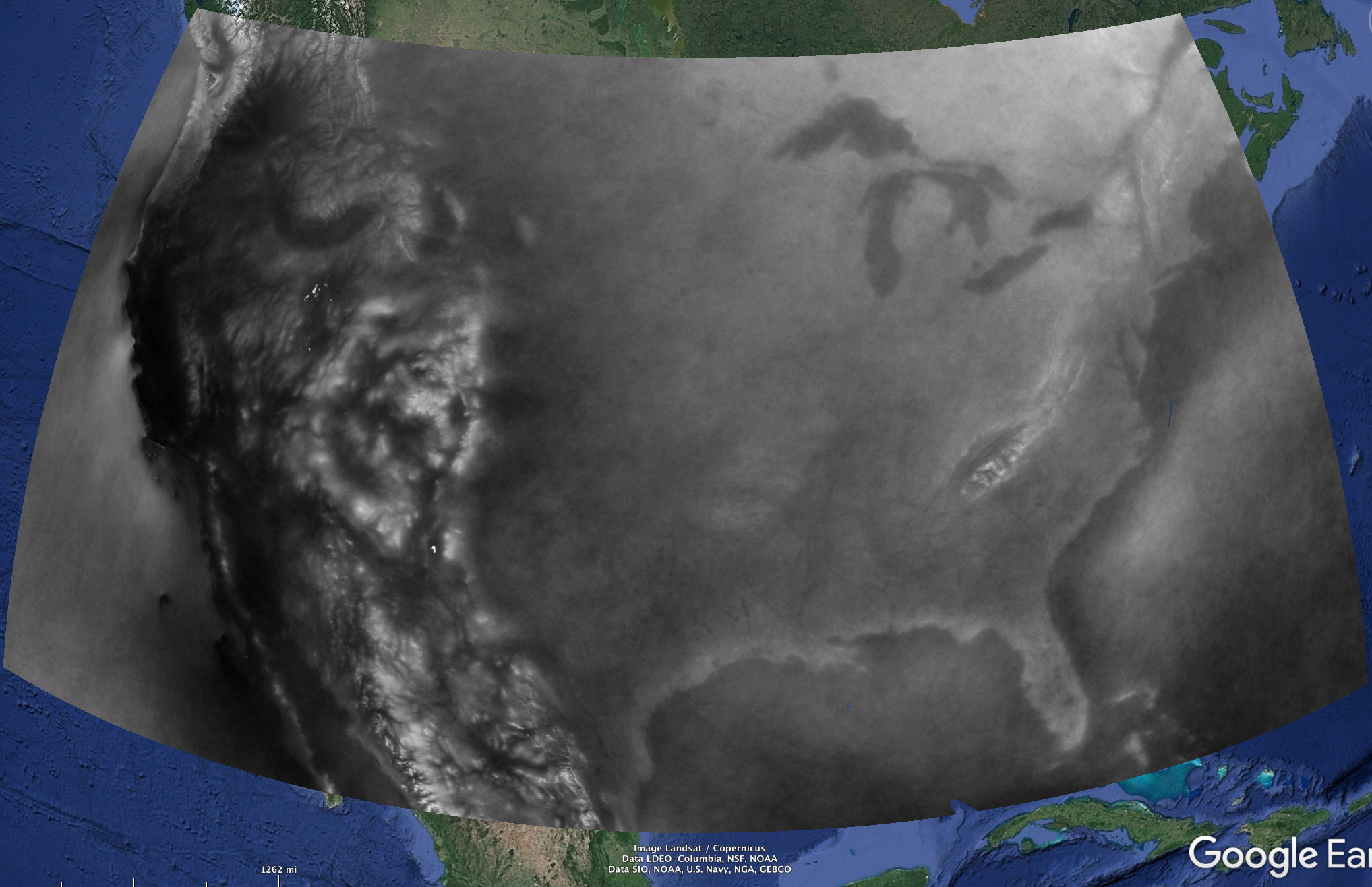
You can (and should) download both grayscale and color cloud climatologies (kmz file) suitable for display in Google Earth. It is best to download these files and then open them in Google Earth. Don’t try to open them in your web browser. We encourage readers to use these (especially the grayscale version), since you can zoom to wherever your area of interest might be. I used a 500m resolution version of the cloudiness to make the kmz file size smaller – no important details have been lost in this process. The color version doesn’t include the two easternmost sections…sorry South Carolina! It also is a May-October average so snow contamination (snow looks like clouds in the visible satellite image) is greater on the high mountains of the west due to inclusion of the May and June data – when high peak snowpack still large. However, the most cloud-free areas (white is least, followed by blue, red highest cloudiness) correspond nicely.
IMPORTANT Google Earth Discussion
I’ve noticed that very few people are downloading the kmz files – they are only about 10-20 mb, so it is not their size. I suspect that relatively few people use Google Earth (not quite the same as Google Maps). When you click on the “grayscale” link in the above paragraph you may get a message indicating a problem like this:
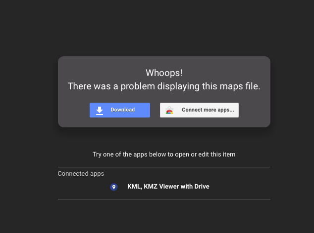
At this point you just need to select “Download” to download the file (automatically) to your computer’s download location. Then, using Google Earth (not the same as Google Maps, but rather an application you can download freely from different internet locations (Google “Google earth” to find suitable locations), open the kmz file you downloaded. The name of the downloaded file is: CLOUDMASK MEANS JUL_SEP aq+terr 500m-3.kmz which indicates it is a mean for the July-Sept period and includes both imagery from the Terra and Aqua satellites and the pixel size is 500m. If you have Google Earth installed on your computer it should normally be the default application to open files that have a “.kmz” extension.
When you open the kmz file in Google Earth, the folder will appear at the bottom, under “Temporary Places” like shown below:
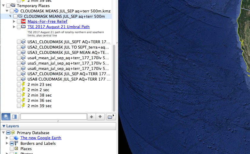
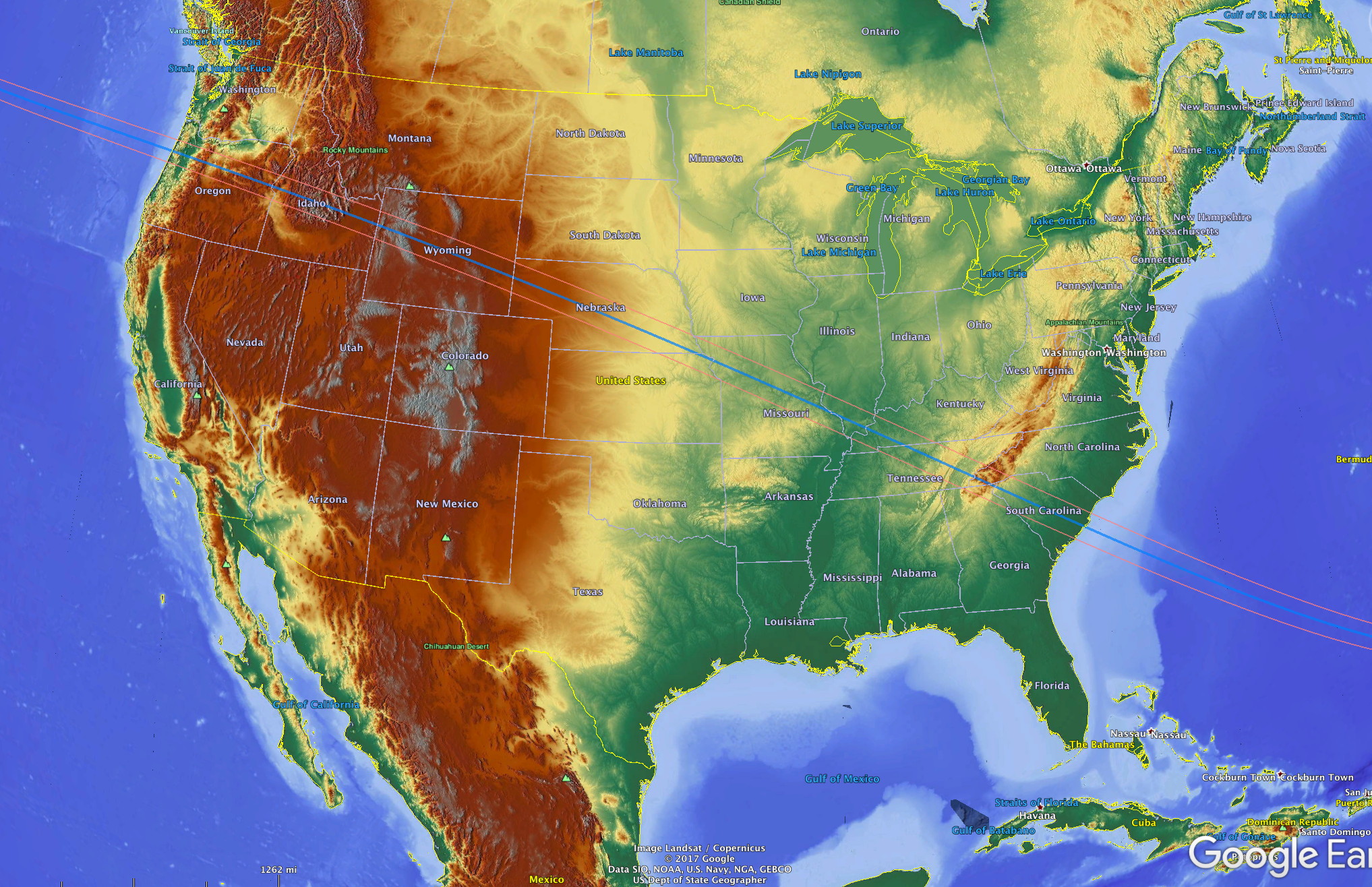
You have to open up the folders to see what is inside them – then click on the ones you want to see. I have included a “Maps-for-free relief” shaded relief data set (beautiful, if you’ve not seen it) BUT if it is clicked it will cover by default anything else you have clicked. So you can dim it or anything else that is clicked by using the slider (the bar just beneath the 2 min 39 sec item in the above image). Normally, you should click every box, or click the top box – then unclick the Maps-for-free box. Play a bit – if you haven’t used Google Earth before. Exploring the satellite cloud climatology via Google Earth is much better than just looking at the jpg files I have made (via screen capture on my large monitor) for your convenience. In Google Earth you can zoon into to your particular town, valley or mountain top to see what the average cloudiness for this summer period is like.
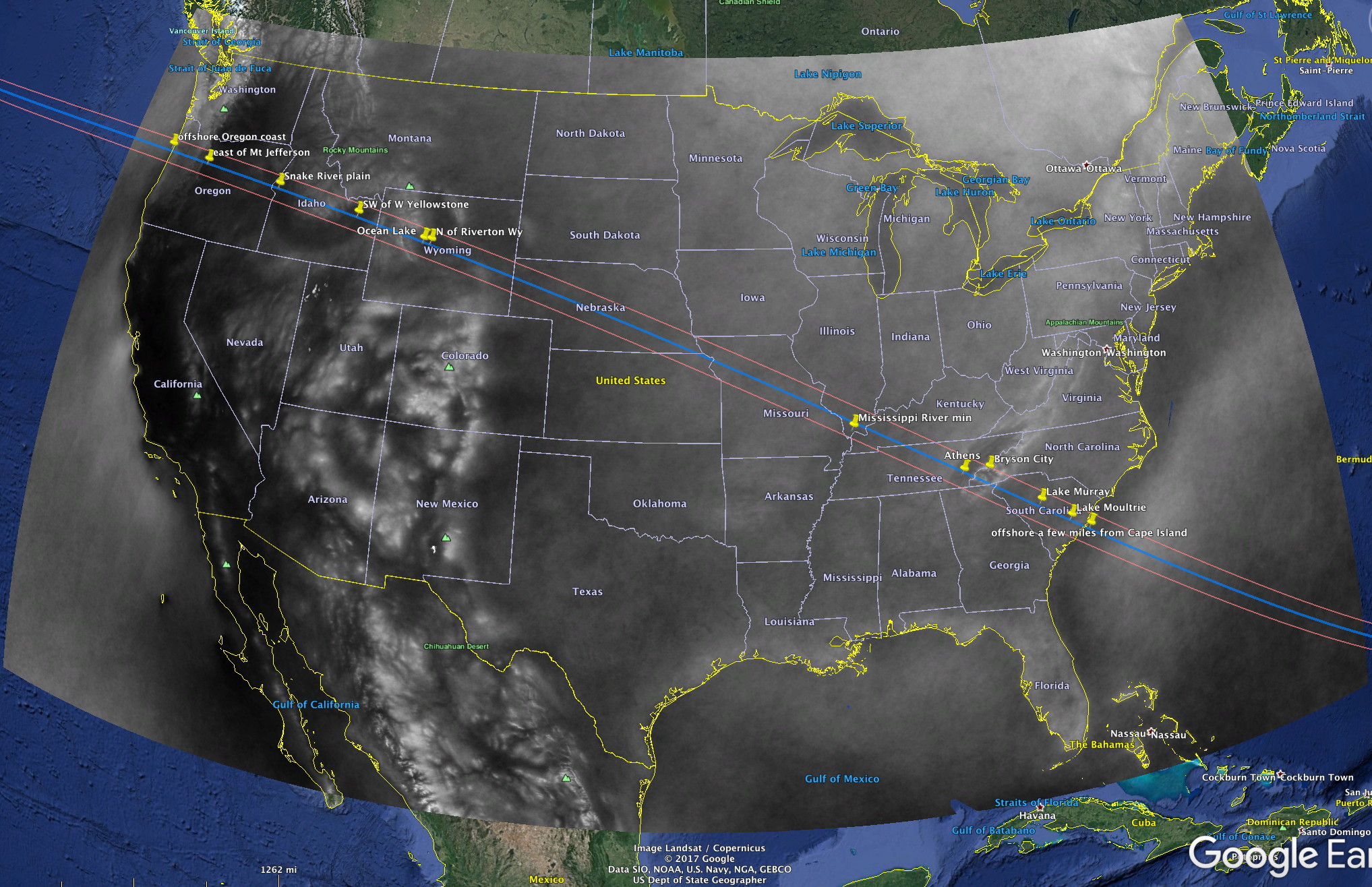
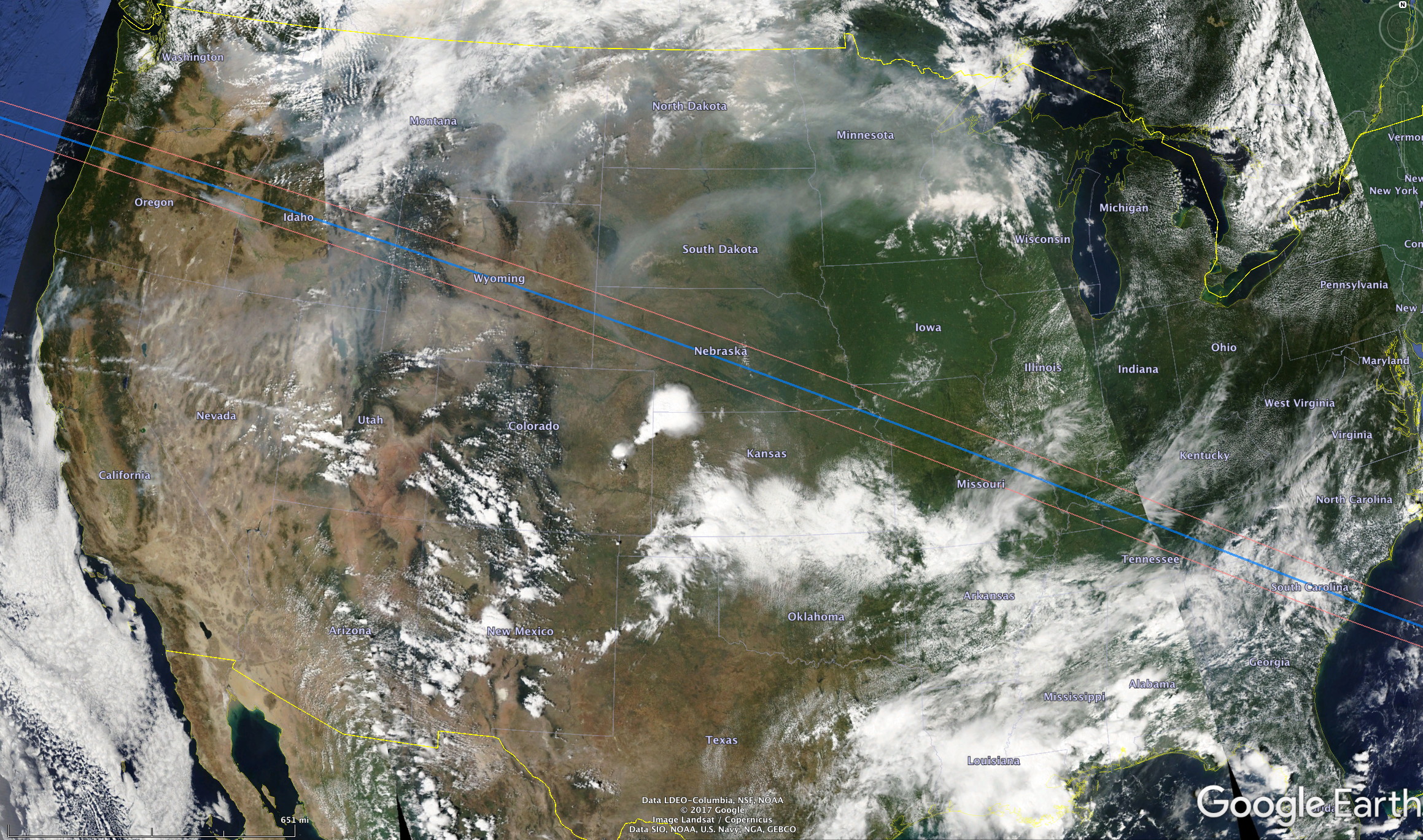
Note that the various items in the kmz file correspond to the satellite cloud climatologies for different NASA sectors covering the USA, for the eclipse path (I unclick the “umbra” box to see better), and I put the duration of totality on the eclipse path at a few locations to remind myself of the duration and how it varies. These duations are not exact – I sort of eyeballed it off another document.
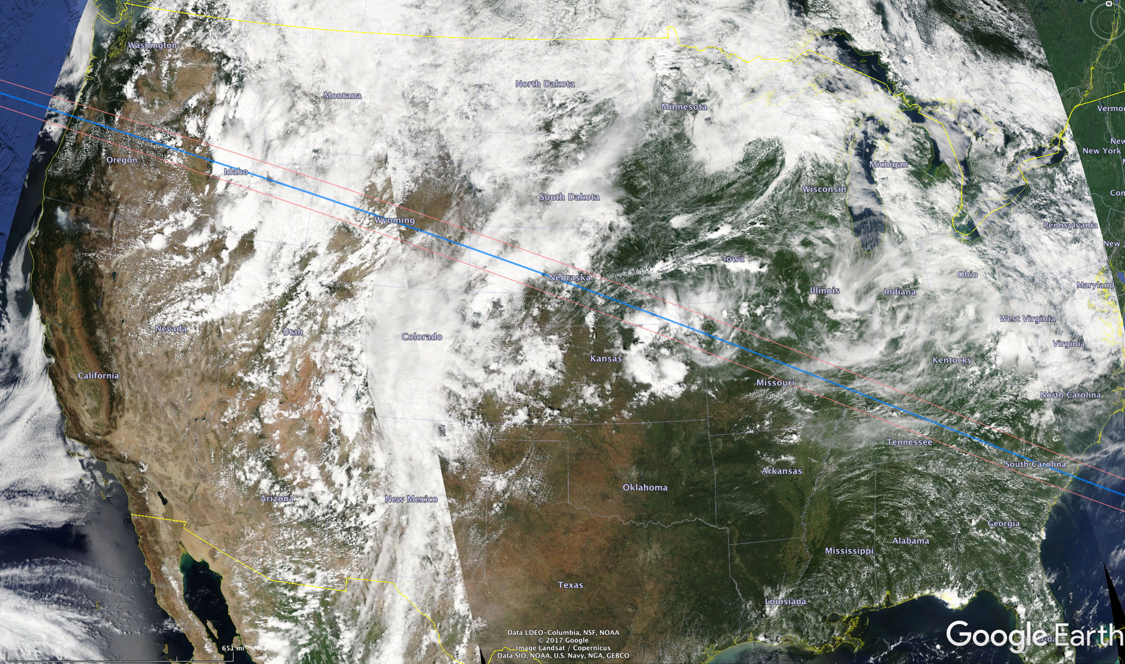
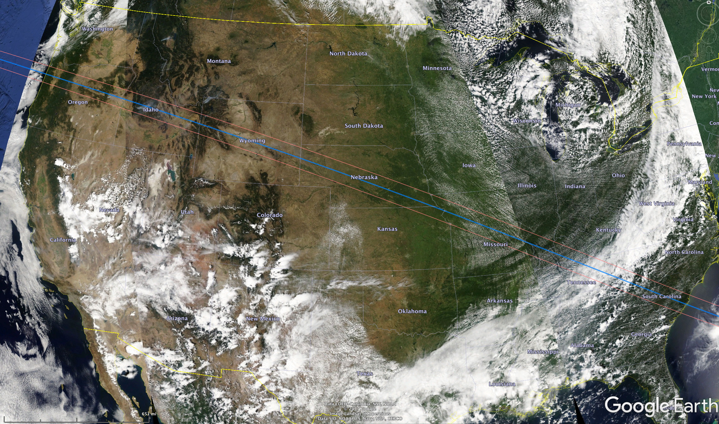
Before going too far, here is a reality check on how much faith you can put in climatology of cloudiness. Below are August 21 130PM cloudiness mosaics (made from a few separate overpasses by the Aqua satellite) for three different years, taken from the MODIS Worldview website. There are large differences from year to year (or day-to-day). Clearly the middle date below would require traveling large distances to find a clear spot in the area of Idaho and Wyoming. The last image below shows a near-ideal day, with almost every place clear from the Oregon Cascades to Kansas City.
Let’s go to the next section to consider some of the better areas to see the eclipse – again, based on the cloud climatology above.
